Four Painters, One Brief
Somewhere in the last week or two “add an image to the post” quietly became “ask the one model you always ask, in the style you always ask for, and take what it gives you.” That’s how a site ends up wearing a uniform. I wanted the opposite: a room full of illustrators who don’t agree with each other, all handed the same one-line brief, and me at the end of the table picking the take that earns the wall.
So now every post here gets four concept images before it gets one.
The two axes
The trick isn’t generating four images. Any engine will hand you four shades of the same picture and call it variety. The trick is two axes, multiplied:
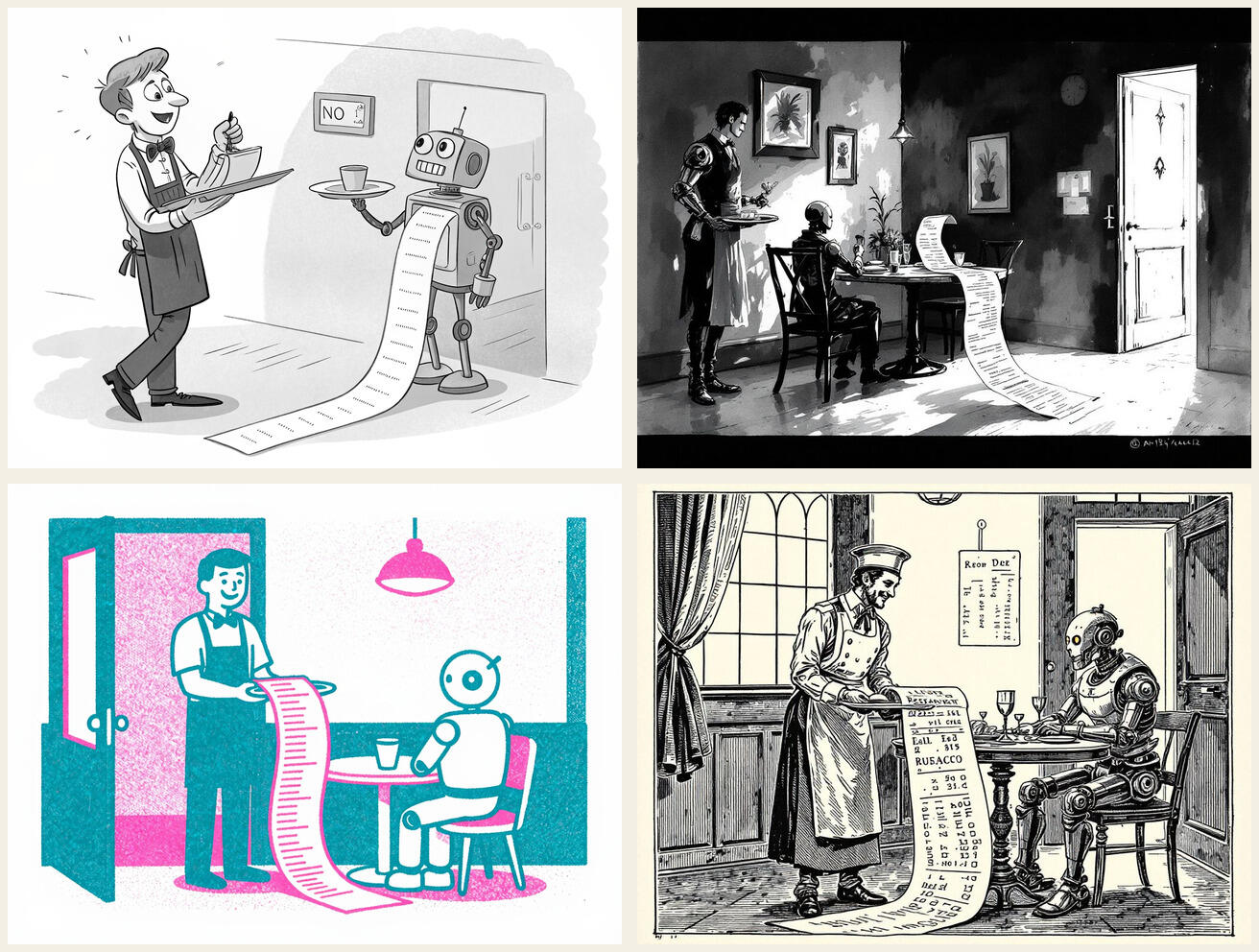
- Four engines, each with an actual personality. A hosted FLUX that’s fast, obedient, and cannot resist painting signage on things no matter how firmly you forbid text. A local image model on my own Mac that takes two and a half minutes per picture, costs nothing, and keeps turning in the best gags. A free community API that fails one request in three and occasionally hands back something better than everyone else. And a hosted specialist that does true flat vector spot-illustration, the kind the others only gesture at.
- Eight styles, rotated so each post draws four: single-panel gag cartoon with ink and wash, one-line continuous drawing, warm mid-century Kodachrome, antique woodcut, two-color risograph, torn-paper collage, dark ink wash played straight, and deadpan technical blueprint. Think of the magazine rack in 1958 and steal from every title on it.
One brief, four hands. The point of the contact sheet is that it argues with itself.
The brief is the work
The pipeline is a manifest file and a script the agent wrote in an afternoon, and neither is the interesting part. The interesting part is the brief: one sentence per post, written by hand, describing a single visual idea. Not “an illustration about AI and labor.” A picture you could describe over the phone: a gleaming machine dispensing an endless conveyor of identical mops and buckets, while a person walks away carrying a paintbrush and easel.
Writing thirty of those in a sitting turns out to be the actual creative labor of the whole system, and it’s exactly the half I’d never hand off. The typing, the API juggling, the retry logic, the contact sheets: all delegated. The one-sentence idea of what the picture is: mine, every time. If you take one thing from this post, take the ratio.
The mechanics, briefly
For the record, the moving parts, all built and driven by the agent while I did other things:
- A JSON manifest: post slug, brief, four engine-and-style pairs per post.
- A hundred-and-fifty-line script, standard library only, that fans each brief out to the
four engines and writes everything into a
concepts/folder that the site generator never publishes. Rejects stay archived, not shipped. - Serial on purpose: the local model is a one-GPU queue, so the batch just walks the list. A full site’s worth (36 posts, 144 images) took about two hours and cost around four dollars. The two free engines did half the work.
- A fallback rule: when the flaky engine fails, the reliable one quietly takes over its style slot, and the notes file remembers who actually painted what.
- Contact sheets assembled per post and sent to my phone. The entire review happens on a couch: I look, I say “I like this one,” and the verdict gets logged next to the exact prompt that produced it.
The two rules that matter
Everything above is plumbing. These two decisions are why the results are usable:
- No text baked into the images. Image models garble lettering, and a caption fused into pixels can’t be edited, translated, or resized. Every caption on this site is real HTML sitting under (or on) the image, which is also what makes the layouts possible: the framed panel with the italic caption below it, and the variant that sets the caption inside the artwork’s empty sky. The white space is part of the brief.
- Concepts are not content. The four candidates live outside the published site, in a folder the build can’t see, with a notes file recording prompt, engine, style, timing, and verdict. Only a winner gets processed (compressed, stripped) into the post, and only with a deliberate layout treatment. A bare image dropped mid-paragraph is how you end up with a uniform again, just a prettier one.
What I’d tell you to steal
Not the script; scripts are an afternoon. Steal the shape: hand-write the one-sentence visual idea, force real variety with engines and styles, review on a contact sheet so the takes compete, keep the rejects, and never let text into the pixels. The machine is a room full of painters who work for pocket change and never sleep. The taste that picks the winner doesn’t come with the room.